Trusted performance with a fresh look.
$3,000 worth of prizes – enter to win!
Explore the Accuro Refresh and discover exciting new time-saving features, including Medical History Flex Panel, Drag & Drop Appointment Scheduling, and more!
We’re celebrating with prizes!
Want to share in the excitement? We’re offering $3000 worth of prizes to celebrate the refresh launch, so enter below to win your choice of one of 6 fantastic gifts.

Yeti Cooler, 3M Littmann CORE Digital Stethoscope, Maverick & Co. Leather Briefcase, Apple Watch, Monos Metro Backpack, Ember Smart Mug
Enter for a chance to win
Fill out the form below for your chance to win!
*By filling out this form you’ll be entered into the prize draw, and you agree to receive communications from Accuro. You may withdraw your consent at any time. We are committed to protecting your information, which will be used in accordance with the applicable data privacy laws and our privacy policy.
The Accuro Refresh: Your workflows with a new look
After 20 years of advancing Accuro on the inside, we’re focusing on the outside with a refresh of the Accuro user interface.
It’s all the functionality you know and trust in your EMR, with design changes that reflect our commitment to innovating and improving your Accuro experience.
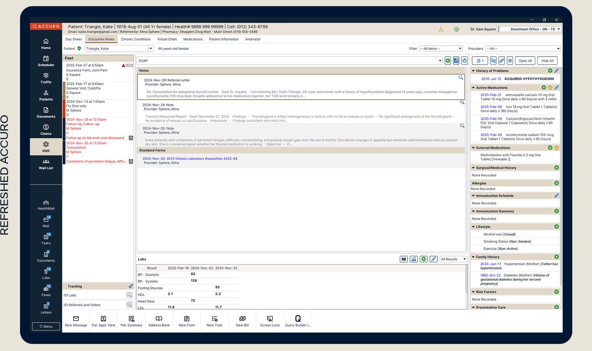
Use the slider below to see a side-by-side comparison of the Accuro EMR Legacy’s Home Section screen and the new Accuro Refresh.
Home Section
 Original
 UIrefresh
What’s refreshed
The new UI refresh gives drop-downs, text fields, and check boxes a new look with updated formatting, improved readability, and a fresh, modern feel that delivers a better user experience.
The font library is simplified from 6 to 1 to help with readability and hierarchy.
There’s more spacing between elements to help you find what you’re looking for faster.
An overlay helps you know which window or pop-up you’re working in.
Simplifying the navigation bar and adjusting the location of the start menu helps you move through the EMR more efficiently.

What’s not changing
We don’t want updates to come at the cost of your productivity, so we made sure to leave our efficient Accuro workflows unchanged:
- We haven’t moved any buttons
- We haven’t changed the layout of the navigation bar
- We worked to keep usability the same across all screens
Evolution starts here
Moving forward means embracing change, not for its own sake but to reflect fresh vision and smart modernization. Discover what inspires us, and how we think about what comes next.
Want to share your insights?
As we continue to improve Accuro EMR with gradual changes to workflows and functionality, your feedback is an important part of our process. Please let us know what you think, or join our User Research Panel and play an active role in shaping the Accuro platform.
 FAQs about the Accuro UI Refresh
All Accuro clients will benefit from the new User Interface (UI) Refresh. It will be rolled out to our clients in groups, but eventually all Accuro users will have the new experience.
The Accuro refresh gives drop-downs, text fields, and check boxes a new look with updated formatting, improved readability, and a fresh, modern feel that delivers a better user experience.
These user interface changes are designed to:
- Improve readability
- Enhance your user experience
- Deliver the modern feel that Accuro users have been asking for
We don’t want updates to come at the cost of your productivity, though, so we made sure to leave our efficient Accuro workflows unchanged.
Spring 2025.
Specific rollout dates are as follows:
- March 18, 2025: All Pilot and Early Access clients will transition to the new UI Refresh.
- Now Available: The refreshed Accuro UI is available to all users.
- June 3, 2025: Access to the legacy version of Accuro will be discontinued. From this date forward, all users will use the refreshed Accuro UI exclusively.
We encourage all users to begin using the refreshed version now to get comfortable before June 3.
Accuro's user interface, which has not been updated since 2016, has become outdated. By updating the look and feel (UI design) of the EMR, we are meeting modern design standards and market expectations after years of investing in Accuro’s functionality and technical innovation.
Like all our projects and features, the refreshed UI has gone through our user testing and feedback process before being released to clients.